FancySelect
A tiny drop-in replacement for native HTML single select elements written in vanilla ES6.
FancySelect
A tiny drop-in replacement for native HTML single select elements written in vanilla ES6.
Motivation
Why not just style a native select element with CSS?
Absolutely do that if it’s enough for your use case. The main reason I created this project is because I needed a drop down list of icons that didn’t suck.
Features
- Zero dependencies
- Very easy to use
- Customizable
- Icon support
- Fully accessible
- Works on all modern browsers (no IE support)
- No multi-select support (not accessible)
Getting Started
Basic usage
Download the latest version, and add the script and style to your page:
<link rel="stylesheet" href="fancyselect.min.css"/>
<script src="fancyselect.min.js"></script>
Or include from a CDN:
<link rel="stylesheet" href="https://cdn.jsdelivr.net/gh/mdbassit/FancySelect@latest/dist/fancyselect.min.css"/>
<script src="https://cdn.jsdelivr.net/gh/mdbassit/FancySelect@latest/dist/fancyselect.min.js"></script>
The native select elements will be replaced automatically.
Excluding specific elements
Once you include FancySelect in your page, it will replace all native select elements with a custom listbox. If you would like to exclude some select elements, simply add the CSS class fsb-ignore.
<!-- This will be rendered as a native select -->
<label for="my-select">My select</label>
<select id="my-select" class="fsb-ignore">
  <option>Neptunium</option>
  <option>Plutonium</option>
  <option>Americium</option>
</select>

<!-- This will be rendered as a custom listbox -->
<label for="my-fancy-select">My fancy select</label>
<select id="my-fancy-select">
  <option>Neptunium</option>
  <option>Plutonium</option>
  <option>Americium</option>
</select>
Updating options
If there is a need to programmatically update a custom listbox’s options, you first need to update the native select’s options, then call FancySelect.update() with the native select element as an argument.
const myselect = document.getElementById('my-select');
const newItems = ['Californium', 'Vibranium', 'Uranium'];

// Add new options to the native select element
newItems.forEach(item => {
  const option = document.createElement('option');
  option.textContent = item;
  myselect.appendChild(option);
});

// Update the custom listbox
FancySelect.update(myselect);
Disabling and enabling
FancySelect detects the disabled state of a native select automatically and applies it to the custom listbox. If a native select element’s disabled state changes after FancySelect’s initialization, calling FancySelect.update() will update it.
const myselect = document.getElementById('my-select');

// Disable the native select element
myselect.disabled = true;

// Update the custom listbox
FancySelect.update(myselect);
Change and input events
An input and a change events are triggered on the original native select element whenever a new option is selected on the custom select box.
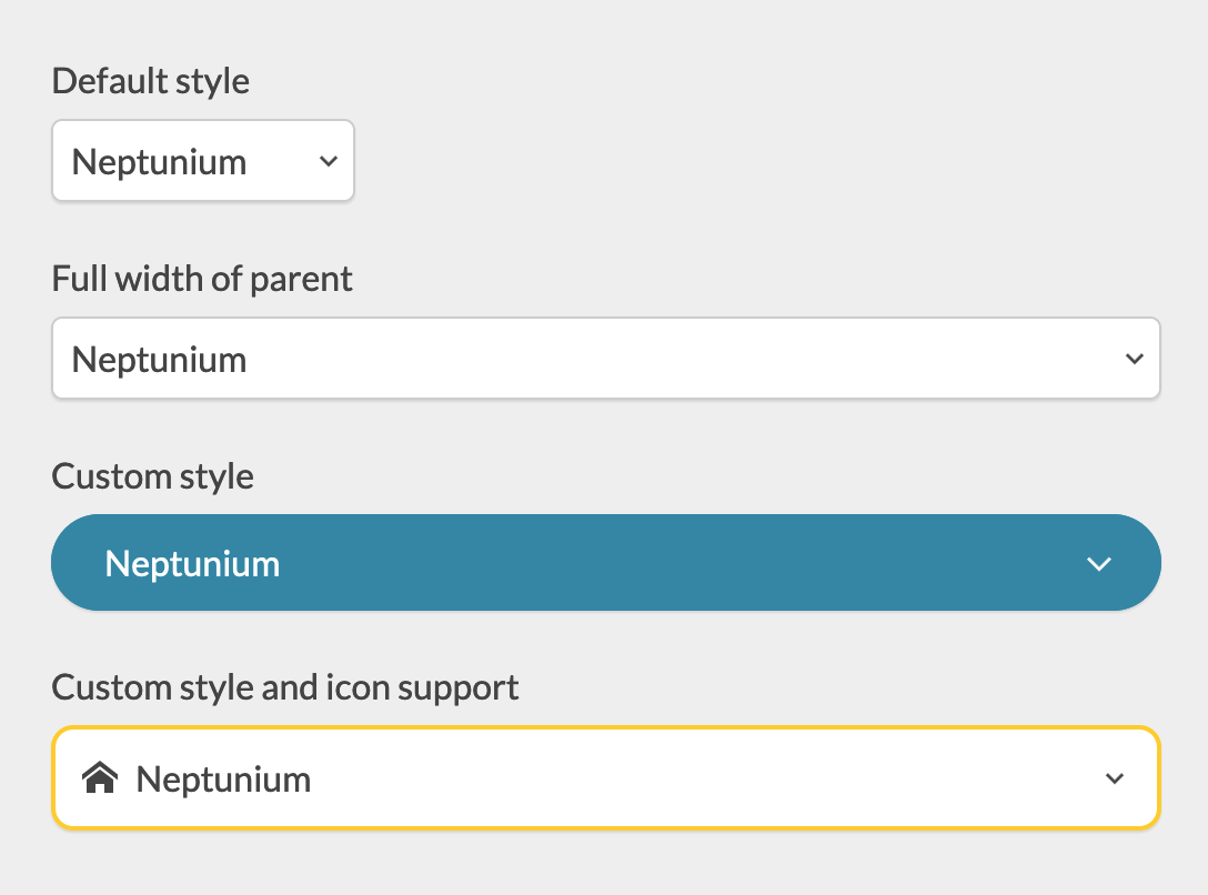
Customization
The look and feel of the listbox and the popup button can be customized with CSS variables.
<div class="custom-style">
  <label for="my-select">My fancy select</label>
  <select id="my-select">
    <option>Neptunium</option>
    <option>Plutonium</option>
    <option>Americium</option>
  </select>
</div>

<style>
.custom-style {
  --fsb-border: 0;
  --fsb-radius: 2em;
  --fsb-color: #fff;
  --fsb-background: #2F86A6;
  --fsb-font-size: 1em;
  --fsb-shadow: 0 1px 1px rgba(0, 0, 0, .1);
  --fsb-padding: .75em 1.5em;
  --fsb-arrow-padding: 1.5em;
  --fsb-arrow-size: .5em;
  --fsb-arrow-color: currentColor;
  --fsb-icon-color: currentColor;
  --fsb-list-height: 200px;
  --fsb-list-border: var(--fsb-border);
  --fsb-list-radius: .75em;
  --fsb-list-color: var(--fsb-color);
  --fsb-list-background: #34BE82;
  --fsb-hover-color: var(--fsb-color);
  --fsb-hover-background: #2FDD92;
}
</style>
Check out the included demo for more examples.
Icons
You can add icons to the select options by setting a data-icon attribute to a valid SVG sprite URI.
<label for="icon-support">Options with icons</label>
<select id="icon-support">
  <option data-icon="icons.svg#nep">Neptunium</option>
  <option data-icon="icons.svg#plu">Plutonium</option>
  <option data-icon="icons.svg#amer">Americium</option>
</select>
The icons can also be defined in the same document.
<svg style="display: none;" xmlns="http://www.w3.org/2000/svg">
  <symbol id="icon-home" viewBox="0 0 24 24">
    <path d="M24 13.839l-12-9.315-12 9.315v-3.798l12-9.315 12 9.315zM21 13.5v9h-6v-6h-6v6h-6v-9l9-6.75z"></path>
  </symbol>
  <symbol id="icon-bin" viewBox="0 0 24 24">
    <path d="M4.5 24h15l1.5-16.5h-18zM15 3v-3h-6v3h-7.5v4.5l1.5-1.5h18l1.5 1.5v-4.5h-7.5zM13.5 3h-3v-1.5h3v1.5z"></path>
  </symbol>
  <symbol id="icon-bookmarks" viewBox="0 0 24 24">
    <path d="M6 3v21l7.5-7.5 7.5 7.5v-21zM18 0h-15v21l1.5-1.5v-18h13.5z"></path>
  </symbol>
</svg>

<label for="icon-support">Options with icons</label>
<select id="icon-support">
  <option data-icon="#icon-home">Home</option>
  <option data-icon="#icon-bin">Delete</option>
  <option data-icon="#icon-bookmarks">Bookmark</option>
</select>
Note: Currently, only SVG sprites are supported, and that’s unlikely to change in the future. Learn more about SVG sprites.
Building from source
Install the development dependencies:
npm install
Run the build script:
npm run build
The built version will be in the dist directory in both minified and full copies.
Credit
While this implementation may be different, most of the specifications were inspired by:
- Collapsible Dropdown Listbox Example | WAI-ARIA Authoring Practices 1.1
- <select> your poison
- <select> your poison part 2: test all the things
License
Copyright (c) 2021 Momo Bassit.
FancySelect is licensed under the MIT license.